Cloud Dancer and colour capping: The interior design directions to watch out for in 2026
SOURCE:Sydney Morning Herald|BY:Robyn Willis
Yes, yes, we know, you don’t follow trends, but it doesn’t hurt to be across what everyone else will be doing. Here’s the experts’ guide to what to expect for interior design next year.
Ask any experienced interior designer or stylist about trends for the new year and you’re likely to be met with the same answer: “I don’t do trends.”
Indeed, even most of us non-professionals consider ourselves immune to the whims and vagaries of design trends, especially when we’re talking about the way we craft the spaces we live in. In truth, though, if you’ve found yourself cultivating a growing collection of indoor plants, experiencing a preference for earthier wall colours or falling in love with art deco design, you have been influenced by some of the strongest trends of the past few years, making you just as susceptible to broader design directions as the rest of us.
Which is nothing to be ashamed of.
In that spirit, we’ve spoken with a range of design professionals about what to expect next year, what they’re loving right now, what they’d like to see more of, and perhaps one or two things they would happily say goodbye to.
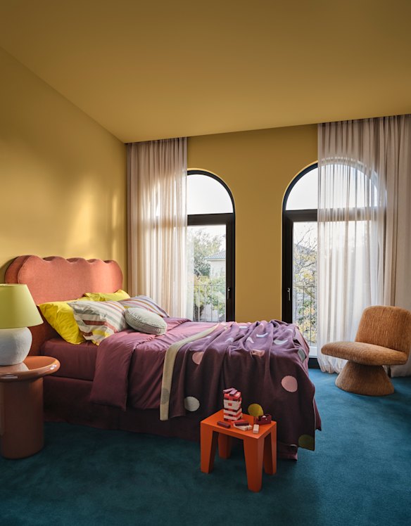
Fortune favours the brave when it comes to choosing paint colours and techniques. For the full drama, opt for colour capping with a ceiling painted darker than the walls, from the Dulux Evoke palette forecast for 2026.Credit: Lisa Cohen and Bree Banfield
The colour forecaster
Let’s start with an unashamed trend monitor. Each year, paint company Dulux releases its Australian forecast for the following 12 months in the form of three colour palettes. Among other tools, the forecast is largely based on international indicators, particularly new designs and releases at the annual Milan Design Fair, to which the team travels each year.
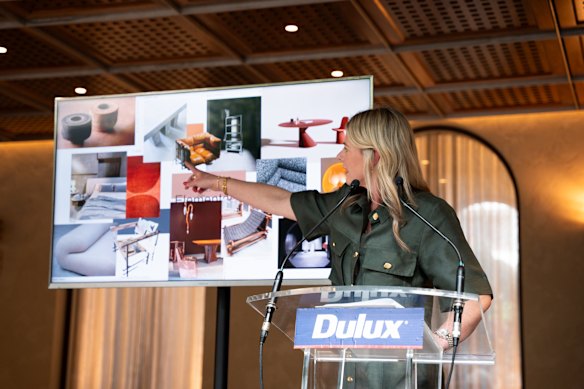
Colour and design manager Lauren Treloar says that of the three palettes released earlier this year, she expects Elemental to be the most popular with home owners in 2026. Heavy on warm neutrals such as Hog Bristle Quarter and Blended Cream, it has added depth with shades of caramel and gold, as well as chocolate browns and steel blues.
“Elemental features a lot of earthy tonal shades which are perfect for people looking to introduce more colour in subtle steps,” she says. “It’s little by little. It’s warm whites with golden brown hues so it’s all about layering, with some warm greys creeping into the palette. It gives stillness and structure to a space.”
Lauren Treloar at the 2026 Dulux Colour Forecast explaining the inspiration behind the Elemental palette. Credit: Julia Firak/Dulux
While she thought Cloud Dancer was a surprising choice for Pantone’s Colour of the Year for 2026 – “we typically see bolder colours from Pantone” – Treloar expects the neutral white will be popular with interiors lovers.
For more adventurous types who really want to create a sense of connection and sanctuary, Treloar says the depths of the Evoke palette will appeal.
“Evoke is very nostalgic,” she says. “We think those colours will be really popular, especially into the cooler months – it has this rich feel and character-filled colours like blush pink, melon and warm mustard. It’s so beautiful.”
Loading
As well as the choice of colours, Treloar expects the popularity of colour drenching – where the same colour is applied to skirting boards and architraves as well as walls – to gain further traction in 2026 as home owners become more comfortable with the concept and feel confident to experiment.
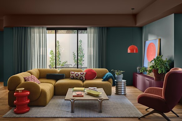
“Next, we’ll see colour capping, which is more popular in commercial spaces [at the moment], where you can see shades or similar colour being used on the ceiling and on the walls, but deeper on the ceiling and lighter on the wall,” she says. “It elevates the space and creates a sense of luxury and brings another dimension to a room.”
Fancy a little colour drenching? This room is enveloped in Dulux Topelo Honey.Credit: Lisa Cohen and Bree Banfield
The stylist
Sydney-based stylist, author and podcaster Jono Fleming has extensive experience creating commercial campaigns, styling for leading interior design magazines as well as creating beautiful homes for an array of clients. He is not a fan of Pantone’s choice for 2026.
“Cloud Dancer felt like a cop out to me,” he says. “It’s inoffensive, but it doesn’t really say anything about who we are or the moment we’re living in on a wider scale, not just in interiors and fashion.
“The colours I saw a lot of during the Milan Design Fair felt more like a response to the world; they’re richer and more emotionally charged – purples, chartreuse, deep reds, burgundy tones. They’re bold, fiery colours that feel expressive and human, rather than neutral for neutrality’s sake.”
He suggests 2026 will see a greater emphasis on pattern, with the most beautiful interiors focused on layering. His hot tip: don’t hold back.
“Pattern on pattern is having a moment,” says Fleming. “One of the clearest signals for me is how people are embracing pattern again, and not just as an accent. We’re seeing pattern layered with pattern, florals with stripes, prints that feel decorative rather than restrained.
“Kendall Jenner’s recent Architectural Digest home tour, designed by Heidi Caillier, is a great example. That floral sofa moment alone feels quietly influential. It gives people permission to be braver and to treat pattern as something to live with, not just admire from afar.”
Open plan, minimalist design is out, Fleming says.
“When it comes to spatial planning, there’s also a noticeable move back towards separation. Living rooms are becoming their own spaces again, rather than an extension of the kitchen. Even within open-plan homes, people are looking for ways to create division through curtains, joinery, levels, or furniture layouts.”
Fleming says the emphasis will be on spaces designed to linger in, rather than pass through.
“Think 70s-inspired lounges, lower seating, conversation pits. The goal isn’t to cut rooms off completely, but to let them talk to each other with a bit more structure and intention.”
It’s time to express yourself and make spaces your own, he says, rather than worry about maintaining overly polished, heavily curated environments.
Loading
The interior designer
James Treble loves nothing better than new projects and new trends and each year, guides industry visitors through emerging design directions via the trade event, Decor+Design in Melbourne. He agrees that next year we’ll see more personalised spaces that truly reflect their owners’ tastes. If you needed permission, he says it’s time to let your freak flag fly.
“Go for some bold, slightly jarring accent pieces to add to your existing scheme. It’s cost-effective, but tells your story,” he says. “Maybe pink orange and navy blue, or some textural fun with some chenille – I love chenille. Have bedspreads in a few rooms and some statement scatter cushions adding pattern and colour.”
The post-Christmas period could be the perfect time to keep a sharp eye out for a quirky roadside find or a piece of furniture your grandmother no longer wants.
“Matchy-matchy furniture sets are not so much in any more, but they are being merged with more eclectic mixed furniture combinations, like it’s been created over time,” he says. “Something old something new, an armchair from nonna, a new coffee table, a lamp from the markets.”
Along with earthy colours, Treble says shapes are more organic with curved edges on furniture, shelving, bedheads and island benches. It’s a design trend that has been in evidence for several years now.
“Curves in all their glory are here to stay,” he proclaims.
The I-don’t-do-trends decorator
To describe Lynda Gardener as a decorator hardly seems adequate. The Melbourne-based author, stylist, retailer and designer has refined her bohemian-country-chic-meets-city-vintage style over decades, and she is quick to advise one thing: she doesn’t follow trends.
But there are some things she loves right now.
“I am always drawn to autumnal tones, chocolates, caramels, natural and neutrals, always layering with texture, and patterns this year for me are stripes, all about a stripe,” she says.
Stylist and decorator Lynda Gardener has developed a timeless look with layers of natural materials such as linen and timber.
She describes her style as timeless, with an emphasis on layered materials that confidently show their age.
“I like layers always, beautiful lush rugs, bed linen, cushions in the tones I love or stripes, even florals,” she says. “I love mixing multiple patterns, such as at home right now I have a checkered rug, stripe cushions and an old floral floor cushion.
“And it works, all in the same autumnal tones, but it works perfectly – and definitely not predictable.”
Make the most of your health, relationships, fitness and nutrition with ourLive Well newsletter**.** Get it in your inbox every Monday**.**